11 Normal Distribution and Central Limit Theorem
11.1 Introduction
In this chapter, we explore the most well-known statistical distribution: the Normal distribution. Often referred to as the “bell curve” because of its distinctive shape, the Normal distribution plays a central role in statistics and data analysis. It is a continuous distribution, meaning it describes variables that can take on any value within a range, as opposed to discrete distributions, which deal with countable values (see Chapter Statistical Distributions).
The prominence of the Normal distribution is largely due to a foundational idea in probability: the Central Limit Theorem. This concept helps explain why the Normal distribution emerges so frequently in practice—even when the underlying data are not normally distributed. We discuss this concept in detail throughout this chapter.
For the rest of this chapter, we will examine the key properties of the Normal distribution, including its parameters and shape. We will also discuss its main statistical measures and demonstrate how to make simulations and calculations from this distribution using R.
11.2 When do we encounter the Normal distribution?
The Normal distribution is one of the most important distributions in statistics. It shows up in many areas of science, medicine, and the social sciences, often as an excellent approximation of real-world data patterns. Human height, blood pressure, IQ scores, and measurement errors in instruments are all classic examples where the Normal distribution provides a good description of variability.
But how did this distribution come to be recognized as so central? Historically, the Normal distribution first appeared in the early 18th century through the work of Abraham de Moivre. He discovered that when the number of trials in a binomial distribution (see next chapter) becomes large, the shape of the binomial can be approximated by what we now call the Normal curve. This was the first indication that the Normal distribution was not just a mathematical curiosity but a useful practical pattern.
Later developments in probability theory — particularly the Law of Large Numbers (LLN) and the Central Limit Theorem (CLT) — helped explain why the Normal distribution emerges so frequently. As discussed in the previous chapter, the LLN tells us that, as we take larger samples, the sample mean will tend to stabilize around the true population mean. The CLT goes further: it shows that the distribution of the sample mean approaches a Normal distribution as the sample size increases, no matter what the underlying population looks like (whether it is skewed, uniform, or otherwise).
Intuitively, this happens because we are adding up or averaging numerous, relatively small contributions (or causes). Some (random) causes push values up, others push them down and, when combined through addition, the extremes tend to cancel each other out. The result is a smoother, symmetric distribution centered around the mean. This is why additive measurement errors — arising from many, relatively small independent disturbances — often follow a Normal pattern.
A useful analogy is that of blending ingredients: no matter how unusual individual flavors may be, when you mix a large number of them together, the final taste becomes stable and balanced. In the same way, when numerous independent factors contribute additively to an outcome, the overall distribution tends toward the familiar bell-shaped Normal curve.
LLN vs CLT
It’s important to understand that, while both the LLN and CLT describe what happens as sample size increases, they describe different phenomena. The LLN is about the accuracy of the sample mean — it tells us that the average of our data gets closer to the true average of the population. The CLT, on the other hand, is about the shape of the distribution of those averages — it tells us that the distribution of sample means becomes approximately Normal. These two theorems can both apply at the same time, but it is essential to remember that each addresses a different aspect of sampling.
11.3 What are the parameters and shape of the Normal distribution?
When a variable \(X\) follows a Normal distribution, we write:
\[ X \sim N(\mu, \sigma) \] Here, the letter \(N\) refers to the Normal distribution, with the two parameters, \(\mu\) and \(\sigma\), defining its shape. Specifically, \(\mu\) is the mean of the distribution, and \(\sigma\) is the standard deviation. These two parameters are all we need to completely describe any Normal distribution.
If \(X\) follows a Normal distribution with parameters \(\mu\) and \(\sigma\), we can describe how likely different values of \(X\) are by using the probability density function (PDF). The PDF is simply the mathematical formula that defines the shape of the distribution. Each continuous theoretical distribution has its own pdf, defined by its unique parameters and equation. For the Normal distribution, the PDF is given by:
\[ f(X) = \frac{1}{\sqrt{2\pi\sigma^2}} e^{\frac{(X - \mu)^2}{2\sigma^2}} \]
Most often, there is no need to memorize PDFs; the important part is to focus on its parameters and appropriateness for application. The key takeaway here is that the values of \(\mu\) and \(\sigma\) determine a normal curve’s ultimate shape and position (in terms of mean). The other components— \(\pi\) (approximately 3.14) and \(e\) (Euler’s number, approximately 2.718)—are mathematical constants.
Let’s break down the role of the two parameters:
-
\(\mu\) (mu) is the mean of the distribution and indicates the center of the curve. It shows where the peak (highest point) of the bell curve is located.
-
\(\sigma\) (sigma) is the standard deviation, which measures the spread of the distribution. A smaller \(\sigma\) produces a narrow, steep curve; a larger \(\sigma\) results in a wider, flatter curve.
These parameters also relate directly to the expected value and the variance of the variable:
\[ E[X] = \mu \] \[ Var[X] = \sigma^2 \]
Let’s look at an example where \(\mu = 0\) and \(\sigma = 1\). The resulting distribution would be the following:
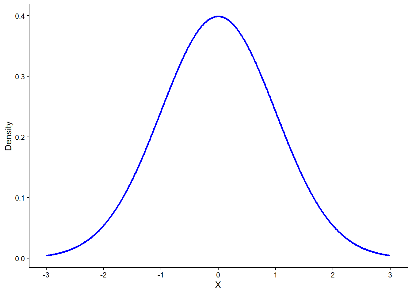
In this plot, the center of the curve is at 0, reflecting the mean, and the spread is defined by a standard deviation of 1. It is visible that the center and peak of the curve lies at approximately 0.4 density. We can actually confirm this using the PDF from earlier by setting \(X = 0\) and using the \(\mu\) and \(\sigma\):
\[ f(X = 0) = \frac{1}{\sqrt{2\pi\sigma^2}} e^{\frac{(X - \mu)^2}{2\sigma^2}} = \frac{1}{\sqrt{2 \times 3.14}}e^0 = 0.4 \]
Regarding the spread, most of the data lies between -3 and +3, which is approximately three standard deviations away from the mean in both directions. This means that the range of the whole distribution (i.e., practically every single observation) is roughly within 6 standard deviations.
When a normal distribution has a mean of 0 and a standard deviation of 1, it is called a standard normal distribution. This idea connects directly to the concept of standardization (see the Scaling Chapter), where standardization transforms a variable setting its mean at 0 and its standard deviation to 1— resulting in what we call a standard normal distribution when applied to normally distributed data. A standard normal distribution is therefore a standardized version of any normal distribution, making it easier to compare values across different datasets or variables.
Now, let’s look how the spread and the peak would change by setting different values to \(\sigma\) but leave \(\mu\) to 0. The following plot shows three different normal distributions with \(\sigma = 1\) (blue), \(\sigma = 1.5\) (grey) and \(\sigma = 2\) (red):
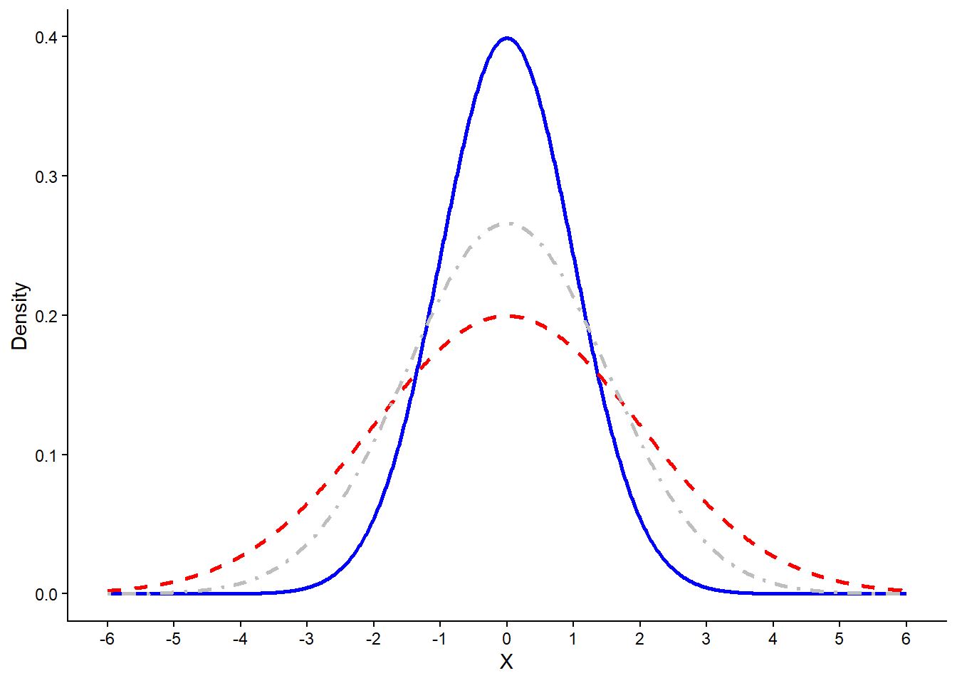
The peak goes higher or lower with different values of standard deviation, while the spread also gets lower or higher respectively, though the center always stays the same. Even though different parameters would lead to a different normal distribution, they all share the same properties. The Normal distribution is always symmetric and bell-shaped, centered around its mean (\(μ\)). Its main features are the following:
-
The peak of the curve is at the mean.
-
The curve is perfectly symmetric around the mean, meaning that the mean, the median and mode are equal. In other words, the lower half of the distribution is a mirror image of the upper half.
-
Although the lowest and highest values in this chart seem to be -3 and 3 respectively, the normal distribution has no limits on either side. In other words, the tails of the distribution approach infinity in both directions. We say that the normal distribution is asymptotic in this case. In the plot above, these lines actually expand to infinities (but are not shown of course).
In each case, we can use the PDF to calculate the likelihood of a value. In our last example, because we have different values for \(\sigma\), the density would be different for \(X = 0\), which is reflected as the different height of the peak.
At this point, it is important to clarify that likelihood is not the same as probability. As also mentioned in the Chapter Statistical Distributions, in a continuous distribution the probability of observing any single, exact value (such as \(X = 0\)) is actually zero. This is because probability in continuous settings is defined over intervals, not individual points. Instead of assigning probabilities to exact values, the PDF tells us how densely packed the probability is around each point. The higher the density at a value, the more “plausible” it is under the given distribution — but this is not the same as saying there’s a 40% chance of getting exactly that value. So, in first example we would say that the likelihood of \(X = 0\) is 40%, but we could also say that the probability of \(X\) being within the interval [-2, +2] is approximately 95%, a percentage that is actually calculated based on the area of the distribution, a concept that was also discussed in the Statistical Distributions Chapter.
Relative likelihood
A related but distinct idea is relative likelihood. This refers to how likely one value is compared to another, based on their density values. For instance, if the density at \(x=0\) is 0.4 and the density at \(x=2\) is 0.2, we can say that \(x=0\) is twice as likely relative to x=2. Relative likelihood doesn’t give you an absolute probability either — it simply compares the plausibility of different outcomes within the distribution.
As an example, let’s focus on the plot below, which reflects the standard normal distribution broken down into standard deviation units. This is actually the same as saying that we have broken down the area into smaller pieces. In this way, we can easily calculate probabilities:
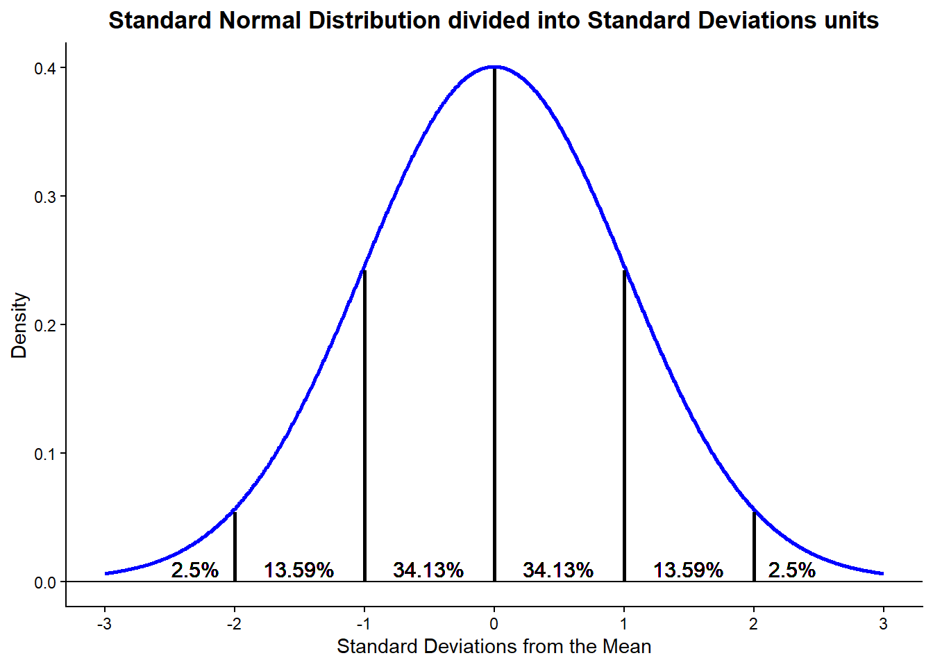
The peak remains the same as before—around 40% likelihood at the center—but now we can also calculate the probability that a value of \(X\) falls within a specific interval. For example, as mentioned earlier, the probability of a random value of \(X\) being within the interval [-2, +2] is approximately 95%. This is calculated by summing up the shaded areas under the curve between -2 and +2, as shown in the plot above.
Each segment in the plot represents a portion of the total probability. For instance, about 68% of the area lies within one standard deviation from the mean (from -1 to +1), about 95% within two standard deviations, and over 99% within three. Because the total area under the curve equals 1 (or 100%), these percentages directly reflect the probabilities we are interested in.
This ability to visualize and calculate probabilities over intervals is one of the key strengths of the Normal distribution and underpins many statistical tools you’ll see later, including confidence intervals and hypothesis testing.
The standard normal distribution is important because it provides a universal frame of reference. In the context of the normal distribution, a standardized value is called z-score. As expected, a z-score tells us how many standard deviations a value is from the mean. Since all z-scores follow the standard normal distribution, we can use a single distribution to calculate probabilities, percentiles, and critical values. This makes the standard normal distribution a powerful tool behind many statistical methods, such as hypothesis testing and confidence intervals, which we discuss in the next chapter.
11.4 Skewness and Kurtosis
At this point, let us introduce two additional key characteristics of any distribution: skewness and kurtosis.
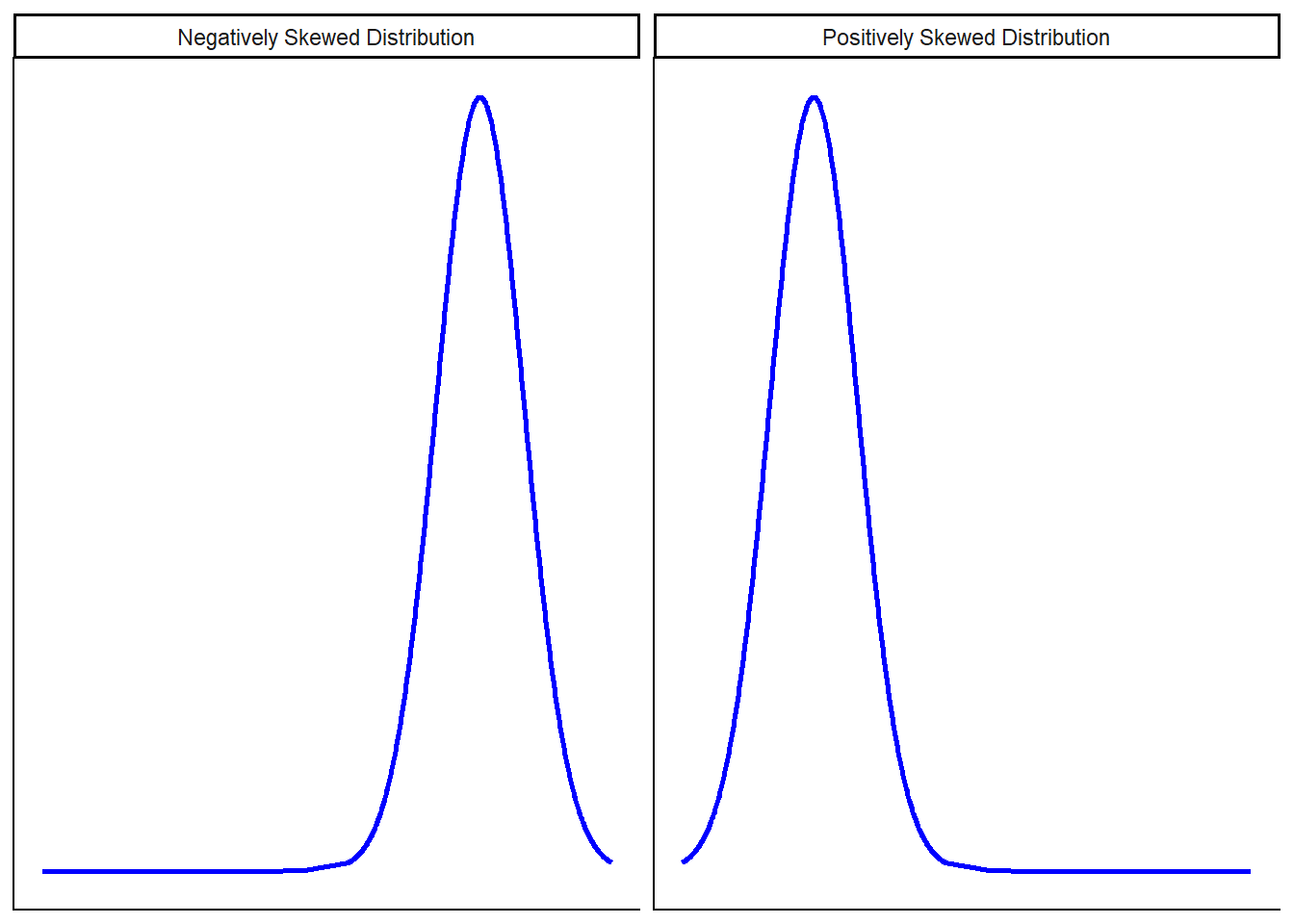
Skewness refers to the asymmetry in the shape of a distribution. In a perfectly symmetrical distribution, such as the Normal distribution, skewness is zero, and the mean, median, and mode all coincide. When the distribution is negatively skewed, it has a longer tail on the left, often caused by a few extremely low values that pull the mean downward. In contrast, a positively skewed distribution has a longer tail on the right due to high outliers pulling the mean upward. One intuitive way to think about skewness is that the mean, median, and mode no longer align: they are spread out across the distribution in different positions. For instance, as seen in the chapter on Statistical Distributions, salary data often exhibit right skewness, with most people earning moderate incomes and a few individuals earning much more, creating a long right tail. Below are visual examples of negatively and positively skewed distributions.
Kurtosis, on the other hand, describes the “tailedness” or the height of the peak of a distribution. It tells us whether the distribution is more or less peaked than the normal distribution.
-
A leptokurtic distribution has a sharper, taller peak than a normal distribution, indicating that more values are concentrated near the center.
-
A platykurtic distribution has a flatter, wider peak than a normal distribution, indicating values are more spread out around the mean.
Here is a graph illustrating normal, leptokurtic, and platykurtic distributions:
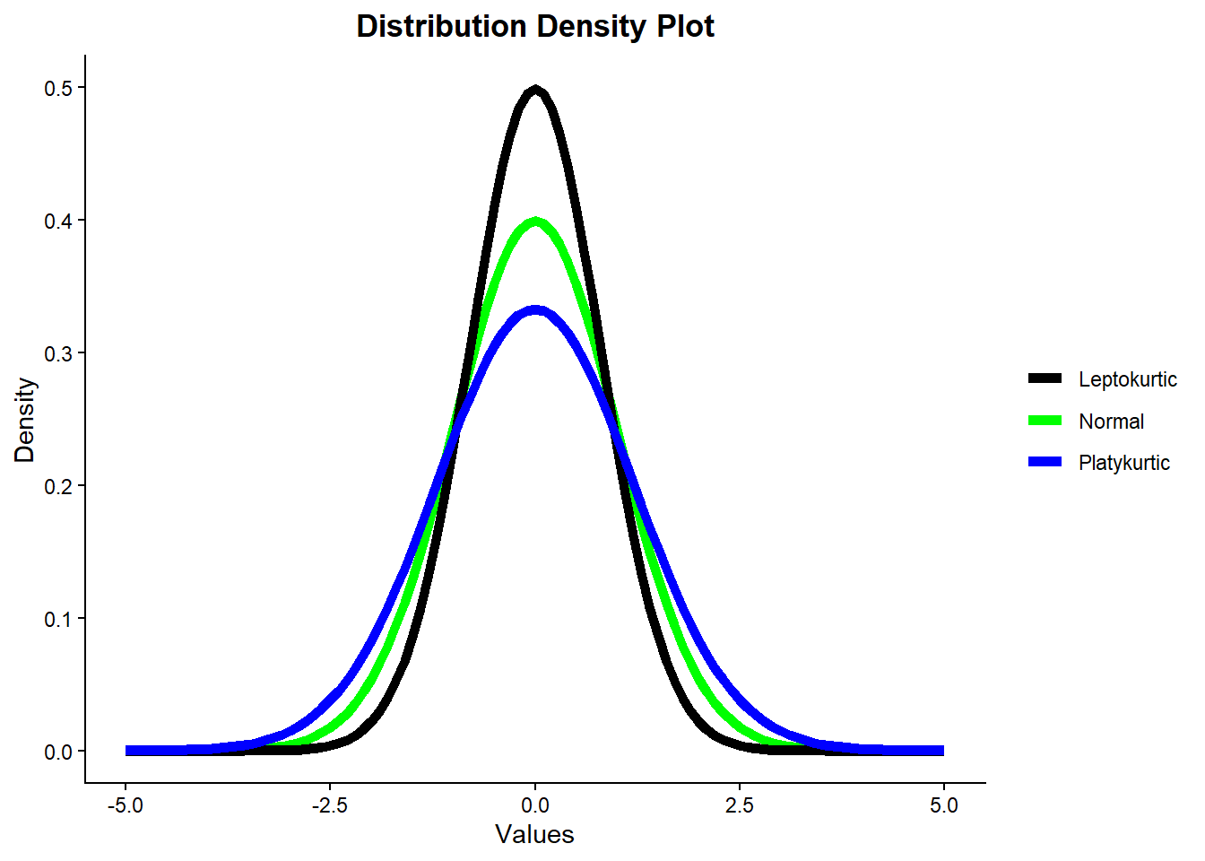
From the graph, we can see that although all three curves have a bell shape, only the green curve represents a true normal distribution. The leptokurtic (black) curve is more peaked and has heavier tails, while the platykurtic (blue) curve is flatter and has lighter tails than the normal curve.
The normal distribution has a specific balance between the concentration of data around the mean and the frequency of extreme values in the tails. Leptokurtic distributions have higher kurtosis, indicating more data concentrated near the mean but also heavier tails with more extreme outliers. Platykurtic distributions have lower kurtosis, indicating data are more evenly spread and fewer extreme outliers.
Since kurtosis directly affects the shape of the probability density function (PDF), deviations from the normal kurtosis value mean that the distribution’s PDF no longer matches that of a true normal distribution. Even if these distributions resemble a bell curve, their differences in peakedness and tail weight imply they do not follow the theoretical properties of the normal distribution exactly. Put differently, leptokurtic and platykurtic distributions may seem normal but they are not. ## Calculating and Simulating in R
Base R provides a consistent set of functions to work with theoretical probability distributions, including the Normal distribution. These functions allow you to simulate random values, calculate probabilities, and more. Each function follows a naming convention: it starts with a specific letter that indicates the type of operation, followed by the name of the distribution.
The main prefixes are:
-
d: for calculating the density (or likelihood) at a given value. -
p: for calculating the cumulative probability (area under the curve to the left of a value). -
q: for calculating the quantile (the value below which a given proportion of data falls). -
r: for random sampling (generating simulated values from the distribution).
To see how these functions work, let’s consider a normal distribution with \(\mu = 1\) and \(\sigma = 2\):
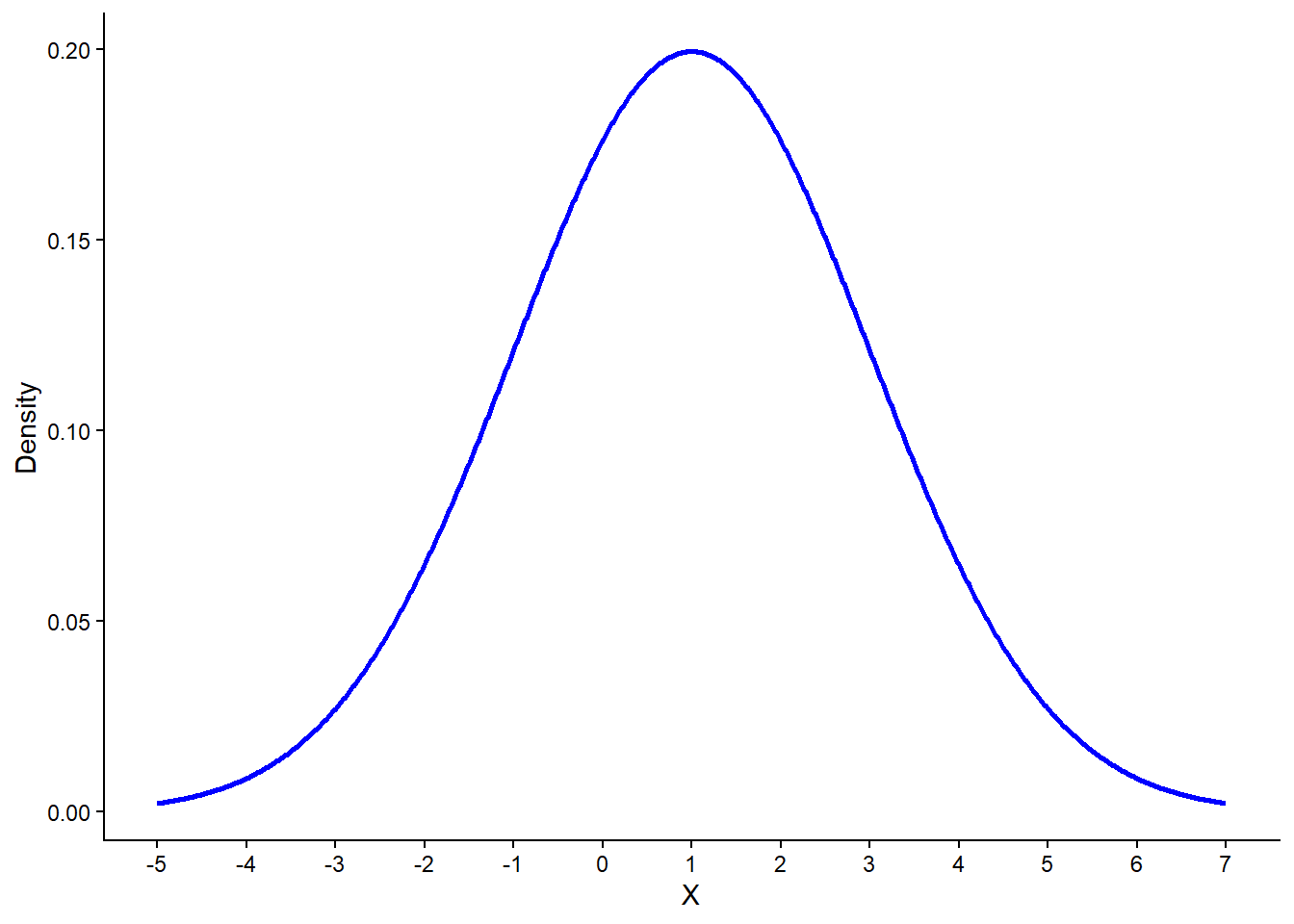
This distribution has a peak at \(X = 1\), which corresponds to the mean. It also shows the typical bell shape, with the spread controlled by the standard deviation \(\sigma = 2\).
To calculate the likelihood (height of the curve) at
\(X=1\), we use the
dnorm() function:
# Calculate density at X = 1
dnorm(x = 1, mean = 1, sd = 2)
[1] 0.1994711The output is approximately 0.2, which matches the height of the peak in the plot above.
Now let’s calculate a cumulative probability — for example, the probability of drawing a value less than or equal to 1. We can visualize this area (the left half of the distribution):
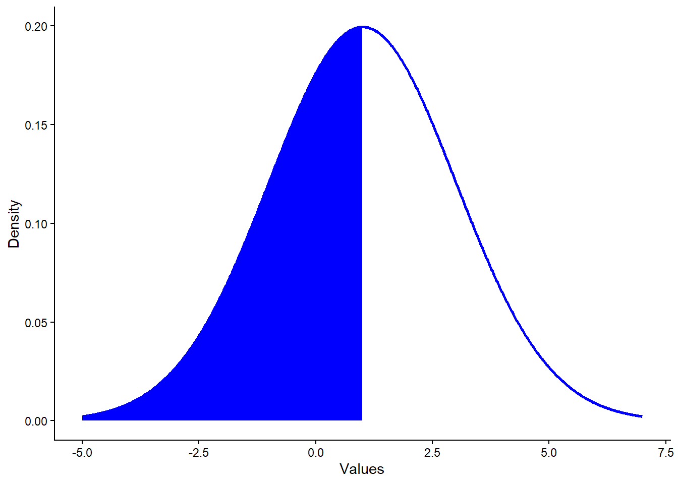
The shaded area represents the cumulative probability for
\(X \le 1\). Since 1 is the mean,
we expect this to be about 50%, which we can confirm with
pnorm():
# Calculate cumulative probability
pnorm(q = 1, mean = 1, sd = 2)
[1] 0.5This returns exactly 0.5, confirming our expectation.
What if we want to go the other way? Suppose we know a cumulative
probability (e.g., 0.95), and we want to find the value of
\(X\) corresponding to it. For
that, we use the qnorm() function:
# Find the 95th percentile
qnorm(p = 0.95, mean = 1, sd = 2)
[1] 4.289707This tells us that about 95% of the values in this distribution fall below approximately 4.29.
So far, we’ve used dnorm(), pnorm(), and
qnorm() for calculations. The final function,
rnorm(), lets us simulate random
values from the distribution. The first argument is how many values
you want to draw.
Let’s simulate 100,000 values from a normal distribution with \(\mu = 1\) and \(\sigma = 2\), and visualize the result:
# Simulate 100,000 values
simulated_data <- rnorm(n = 100000, mean = 1, sd = 2)

# Plot histogram
tibble(x = simulated_data) %>%
    ggplot(aes(x = x, y = ..density..)) +
    geom_histogram(bins = 50,
                   fill = "lightblue",
                   color = "black") +
    labs(x = "Simulated X",
         y = "Density") +
    theme_classic()
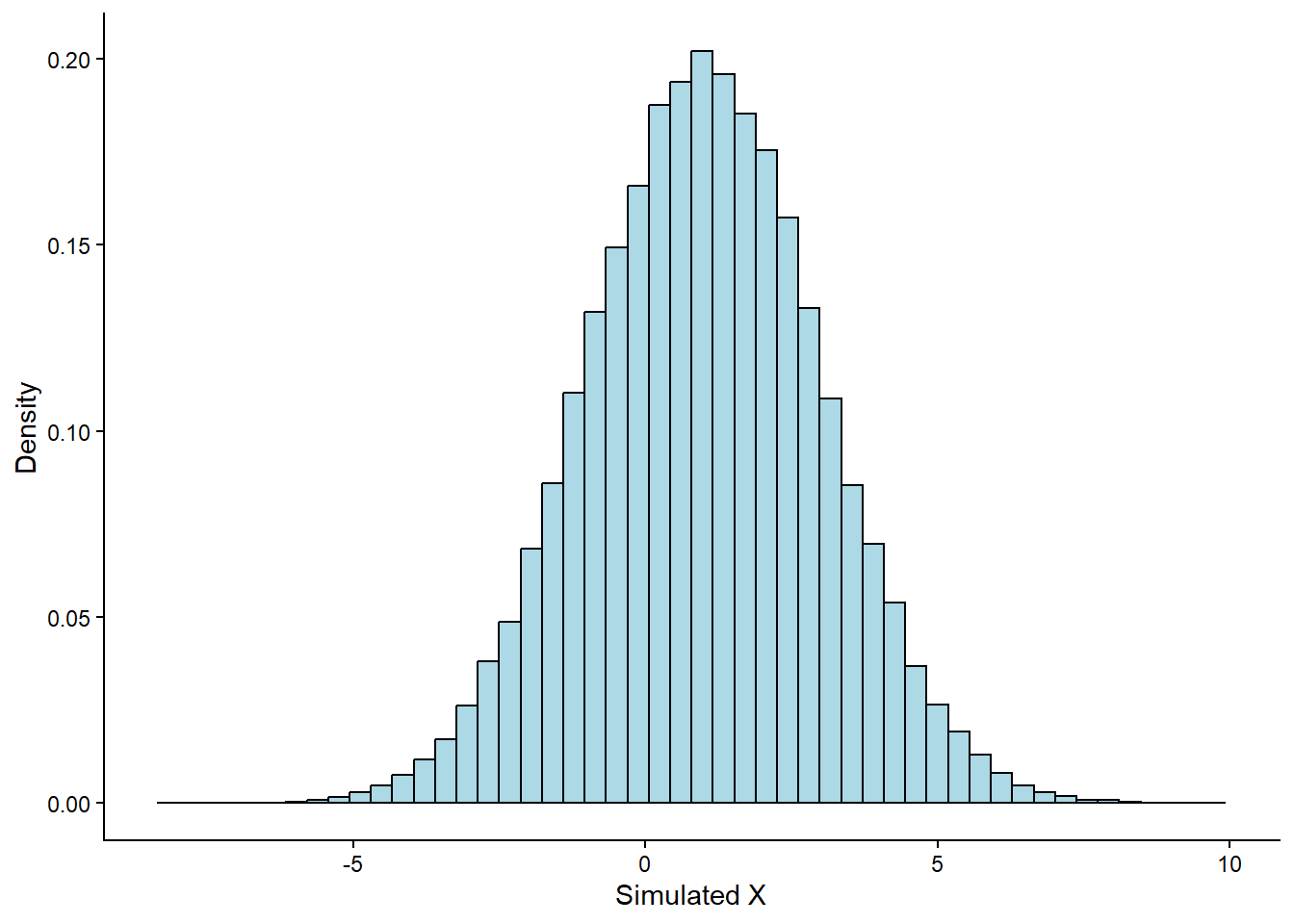
As expected, the histogram closely follows the theoretical Normal curve shown in red. This demonstrates how simulation allows us to approximate theoretical distributions with real samples.
11.5 Central Limit Theorem with Simulation
We mentioned earlier that the Central Limit Theorem (CLT) tells us something powerful: when we take the average of many independent samples from any distribution (with finite mean and variance), the distribution of those averages will approximate a normal distribution, even if the original distribution is not normal.
We can demonstrate the CLT through simulation in R. To do so, we’ll
intentionally avoid using rnorm(), which draws values
directly from a normal distribution. That would defeat the point,
since the result would already be normal by design. Instead, we’ll
draw values from a log-normal distribution, which
is known for being positively skewed (long right tail). We’ll
discuss this distribution in more depth in another chapter; for now,
it’s enough to understand that it is not symmetric and not normal.
Let’s look at the shape of a log-normal distribution by drawing 1,000 values and plotting their histogram:
# Set seed
set.seed(125)

# Draw 1,000 values from a log-normal distribution and plot
tibble(X = rlnorm(n = 1000, meanlog = 0, sdlog = 1)) %>%
  ggplot(aes(x = X, y = ..density..)) +
  geom_histogram(bins = 50,
                 fill = "lightblue",
                 color = "black") +
  labs(x = "X",
       y = "Density") +
  theme_classic()
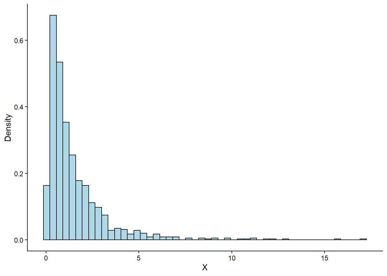
As expected, the plot is heavily skewed to the right. The peak is near zero, and the tail extends far into larger values, which is a typical log-normal shape.
Now let’s apply the Central Limit Theorem.
We simulate this by repeating the following process:
-
Draw a sample of size 1,000 observations from the log-normal distribution.
-
Compute the mean of that sample.
-
Repeat this process 10,000 times to build a distribution of sample means.
Here’s how we implement it in R:
# Set seed
set.seed(125)

# Simulate 10,000 sample means
tibble(Sample_Number = 1:10000) %>%
  group_by(Sample_Number) %>%
  mutate(Sample_Average = mean(rlnorm(n = 1000, meanlog = 0))) %>%
  ungroup() %>%
  ggplot(aes(x = Sample_Average)) +
  geom_density(fill = "lightblue") +
  labs(x = "Sample Average",
       y = "Density") +
  theme_classic()
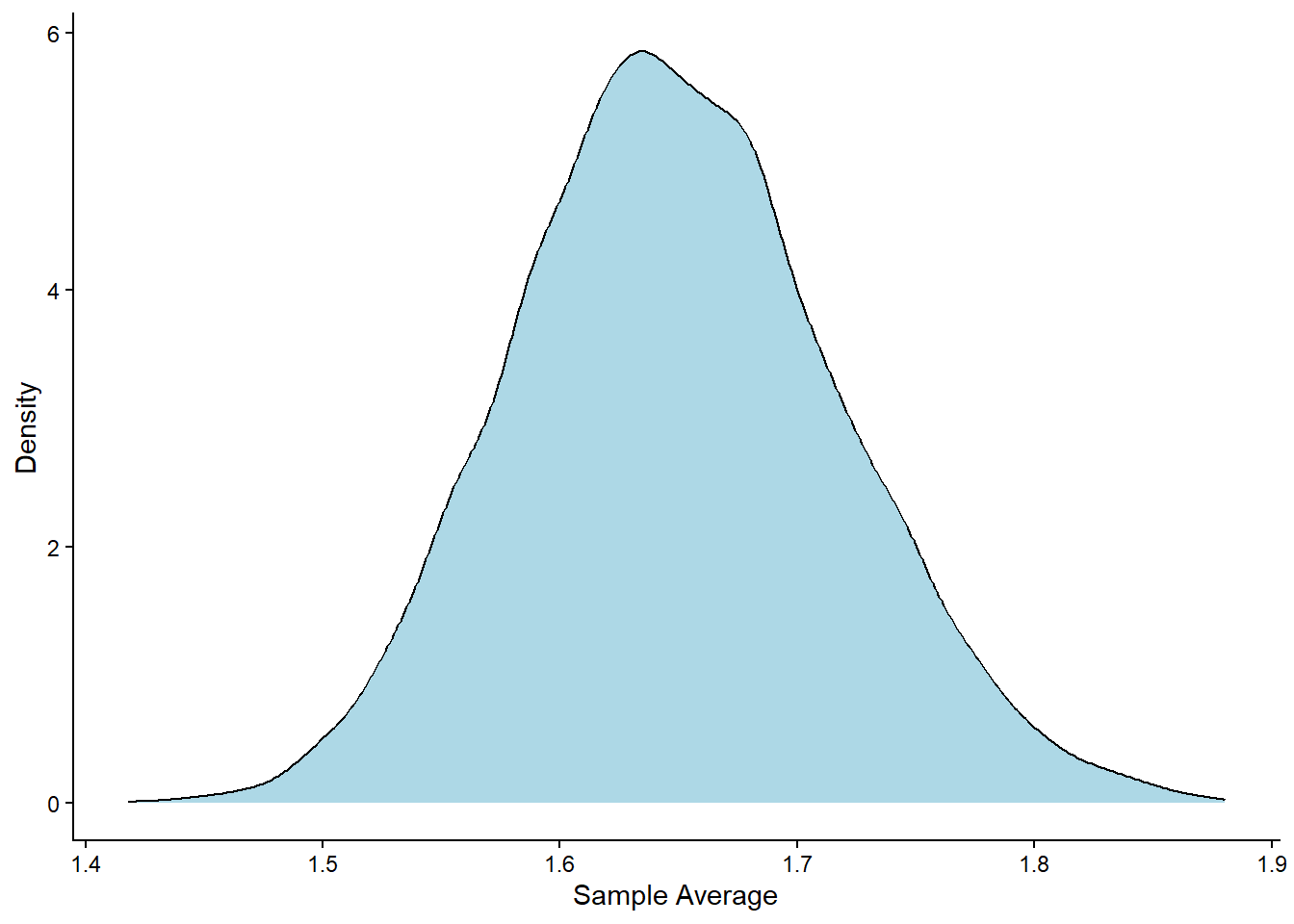
Despite the original data being skewed, the resulting distribution of the sample means looks remarkably normal. This is exactly what the CLT predicts.
This simulation highlights why the Central Limit Theorem is so important. It explains why we can often use the normal distribution to make inferences about averages or totals, even when the data we start with doesn’t follow a normal distribution. In practice, this means we can use tools based on the normal distribution (like confidence intervals and hypothesis tests) far more broadly than one might expect.
It’s also important to remember that just because a sample does not look normally distributed, that doesn’t necessarily mean the population it came from isn’t normal. A single sample, especially if it’s small or biased, can easily misrepresent the true shape of the population. Random variation, sampling error, or systematic bias can all distort what we see in a sample, so we should be careful not to draw strong conclusions about the population based on sample shape alone
11.6 When the CLT Does and Does Not Apply
The Central Limit Theorem (CLT) is a powerful result, but it doesn’t apply in all situations. It works well only under certain conditions.
For the CLT to hold, the following must be true:
-
Independent observations: The values we sample must not influence each other.
-
Same population: All samples should come from the same distribution.
-
Finite variance: The spread of the population must be limited. If the variance is infinite, the sample mean may never stabilize.
If these conditions are met and the sample size is large enough, then the CLT kicks in: the distribution of the sample mean becomes approximately Normal, even if the original data were skewed or irregular.
However, if the population has heavy tails (like the Cauchy distribution), or the sample size is small, the CLT might not apply or might give poor results. In such cases, we shouldn’t expect the sample mean to follow a Normal pattern.
11.7 Recap
In this chapter, we explored the Normal distribution, one of the most common and important distributions in statistics. We saw that it manifests as a symmetric, bell-shaped curve, fully defined by its mean and standard deviation. The mean determines the center of the distribution, while the standard deviation tells us how spread-out the values are around that center. We also discussed the Central Limit Theorem, a powerful result that shows how the distribution of the sample mean becomes approximately Normal as the sample size grows, regardless of the shape of the original data Throughout the chapter, we used R to generate, visualize, and analyze Normal data, helping us connect theory with practice. Finally, this chapter laid the foundation for calculating probabilities and simulating data using other theoretical distributions, which we will explore in the chapters to come.